In this post I will share:
My goal is to help you improve your chances of getting the job that you want and avoiding those common mistakes that hold us back.
What makes a CV suck
I’ve had so many people ask me to review their CVs and it’s that one request that just feels too similar to filing a tax return, getting a prostate exam from a doctor with chubby digits, or those moments just before you take your t-shirt off at the beach after binging on mince pies for the last month – I’d rather not.
And the problem isn’t that there’s something wrong with the words on the page, the single biggest problem with most CVs is that it’s not created with the reader in mind – the over-worked manager you’re trying to impress.
Let’s paint a picture together:
You’ve just had a key team member resign and you’re ready to advertise the role because you need to fill their spot. It’s taken a few hours, but you believe that you’ve crafted the wording perfectly to discourage the chancers from applying and to find the one. You romanticize imagine uncovering the best of the best, your new work soulmate, who will help you kick ass on every deliverable and lead you to scoring that big fat bonus at the end of the performance calendar. Yes, yes, yes!
You’ve handed the ad to the powers that be (Human Resources) and now you wait patiently for applications to close and the interview process to kick off – sharpening your culling blade with a ruthless smile.
A few weeks go by and you get a notification that your HR Rep has closed the ad, created an initial CV shortlist and is on their way to drop them off at your desk. The moment has finally come! You start dreaming about wading through the stack of resumes and to uncover that golden ticket CV as if it was sent by the Gods specifically for you to find.
But what happens is completely different to what you just fantasized…
In walks the HR rep with a pile of 100 CVs (because you received 757 bloody applications) and plops these on your desk. It’s clear that the next 3 to 5 hours of your Friday night will be spent wading through CVs that all have the following “standards”:
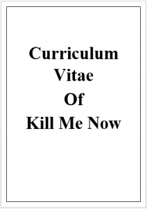
- 1x Cover Page with the words “Curriculum Vitae of ….” in Bold 72 size font possibly made in Word Art
- 5 to 10 pages of Times New Roman size 12 font bullet points or paragraphs with 1.5 line spacing
- Paragraphs of stuff written in jargon and at such a high level that you’re actually not sure what it means. “I was instrumental in ensuring the CFO had access to the latest reports on a Weekly basis” – or did you just print out some spreadsheets bro?
- Somewhere on page 2 you’ll find their ID number, sex, marital status, sexual preference and favourite colour – who even decided that this was necessary?
- Under the skills section, Microsoft Excel is listed as Advanced – yet most people don’t know how to do a Pivot Table or VLOOKUP

Call the doctor. I’m ready for my exam (loosens pants and assumes the position).
We tend to over-engineer CVs with pages of info actually ticking our own boxes and putting EVERYTHING down hoping to impress. “Surely, if they see how qualified I am by the 17 pages of projects and how well-rounded I am from the volunteer work I did in 2003 they’ll stop the search”. We’re too busy ticking boxes that don’t matter rather than taking a moment to wonder whether that the over-worked manager even cares.
5 tips to a sexier CV
I view a CV as a conversation starter or opener. Just enough to pique the interest of an organisation and get your foot in the door. A way to separate you from everyone else and whisper into that manager’s ear that you’re the one they’ve been looking for all their lives. A pile of 757 CV submissions is not uncommon – you gotta stand out and rise to the top!
- Make it relevant: You’ve heard this said for the cover letter: Make sure it’s customised for each role you apply for. Yet we send the same CV template over and over. Times have changed since you drafted that first CV in 2007. Most people have developed social media induced ADD and concentration spans resemble that of a goldfish. Tweak that CV doc to be relevant to the way people consume information.
- Make sure it’s engaging AF: Most recruiters, managers etc. only have a few minutes to glance through everything. If it’s boring, you risk losing them before you’re given a chance to charm your way into their hearts in the interview. Cut out the fluff and long paragraphs and work on telling a better story.
- Make it easy for me: We don’t want to read your full life story. Frankly, most of us don’t actually care. Be short, sharp and be gone – get to the point and make me want to call you back. Also arrange it in a logical order that puts what I need to see first. Time is money.
- Make it pretty: Human beings are superficial. We like pretty things. Make sure its formatted well. Maybe include a picture or diagram. Everyone loves an infographic or dashboard. Your CV is the first introduction to your personal brand. Ensuring it’s well put together and prettier than everyone else’s will make me want to tear it open… and read it.
- Make it real: No, I’m not talking about removing false info – that shouldn’t of been there in the first place. What I’m talking about is reducing the corporate jargon and business speak and to just tell your story how you would – no bullshit and again representing your personal brand. Being yourself is what makes you different from everyone else. But defaulting to the common monotonous tone or bullet points makes it just another CV.
My badass 1-page CV template
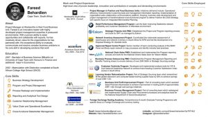
Because I’m a nice guy, I’m going to share the CV template that I used to get my last 3 jobs. It’s something that I first created in 2013 while I was in Management Consulting so it will have that consultingy feel to it – which I like.
It’s a mix of a few styles of CV that I drew inspiration from, but it still had to be editable within my skillset (i.e. with Excel and PowerPoint lol). I don’t have extra cash available to have a Graphic Designer do it for me, but if you have illustration skills then you can really make a hardcore CV. Here are some examples from a simple Google Search.
I’ve taken a few elements from infographic CV templates I’ve seen (like a timeline, icons and logos) as well as applied design cues that I’ve come to love (like the use of white space to separate sections, minimal design and colour accents to match my website style) and tried to tell a story about who I am and what I am capable of in as badass a way as possible with no bullshit. And it’s worked.
You will notice that it is not in Microsoft Word. I created it in Google Slides so that anyone with a web browser should be able to edit it by simply uploading it. For ease of use, it is exported in Microsoft PowerPoint format so you can edit it at work when your manager isn’t looking.
As with all CVs, it is a work in progress and I’ve continually been tweaking it over the years. I generally refresh it once a year to add in a few touches related to prevailing design trends, update my info etc. and will most likely change as new CV standards get set. The time for long-ass CVs in Times New Roman size 12 font with 1.5 line spacing needs to come to an end.
For what it’s worth, I do keep a longer form CV in Word (just in case), but it rarely gets asked for. This 1-pager is usually all I need to get that interview and BOOM! I’m in there.
Question: Do you agree with the 1-page CV? Keen to share your version of a badass CV template? Drop a comment below or mail me at [email protected]

Leave a Reply