Line charts are my favourite. So simple and uncomplicated.
However, the standard line chart formatting in PowerPoint needs help. Charts often look too jagged and give your slide a dated look.
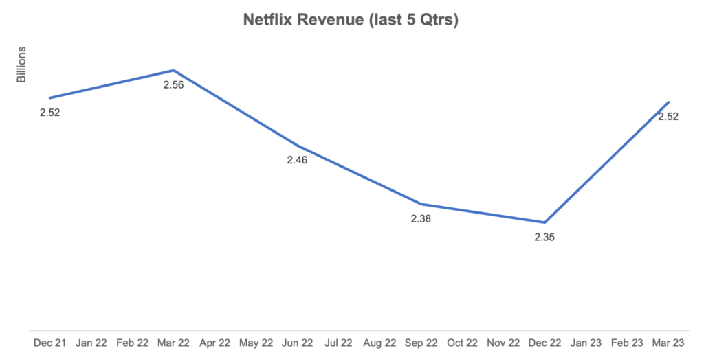
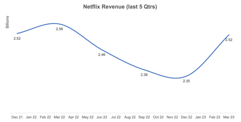
A quick fix is hidden in the formatting section to make your line chart look smooth and modern 👇
How to:
- Click on the graph and select the series (i.e. line) you want to format
- Right-click and select “Format Data Series” to open the format menu
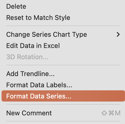
- On the Fill & Line section (the paint bucket icon), scroll to the bottom and select the “Smoothed line” option


It’s as simple as that. Now you can add that modern look and feel to all your line charts. This same technique can be followed in Excel too.
Would you like more tips like this?
Join 200+ ambitious professionals reading my newsletter. Subscribe and get practical tips every Tuesday to level up how you share ideas at work💡
Leave a Reply