It’s Tuesday and time to discover how to make your presentations pop✨
The crowd went wild this week because Apple brought the heat in their WWDC keynote. There is so much to unpack so let’s get into it!
In this edition:
- 🎓 Learn: How to apply text effects just like Apple
- 💻 Presentation Breakdown: Apple’s Keynote from WWDC
- 💡 Idea: Lasting wins require a lifestyle
🎓 Learn: How to apply text effects just like Apple
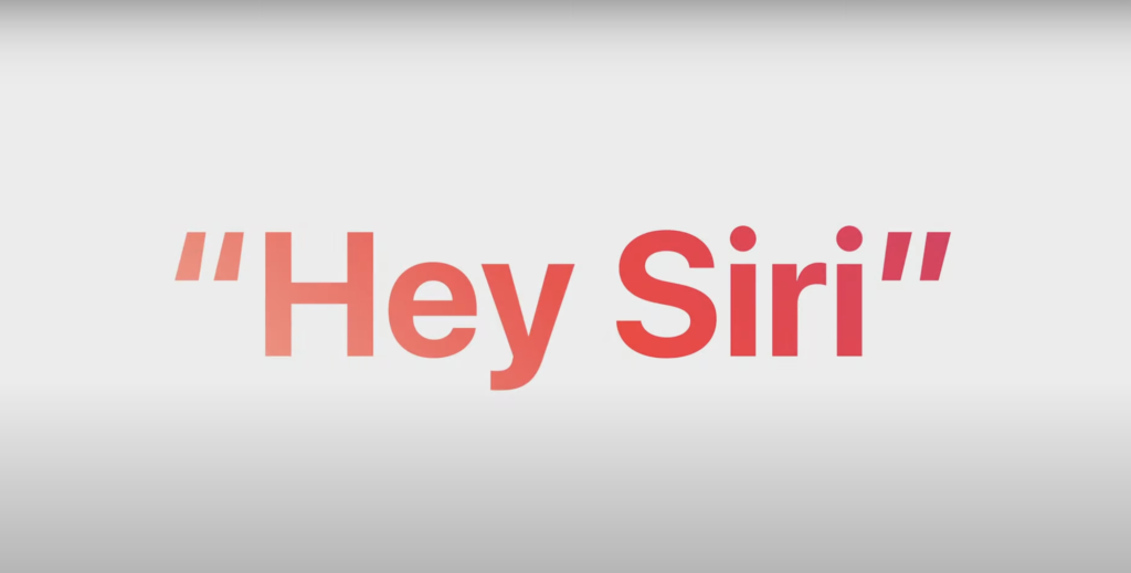
Among all the complex transitions and animations in the Apple WWDC keynote, it was the text effect that really caught my eye. It’s something that takes only a few clicks and adds a nice modern feel to your slides.
Let me show you how to add this to your next presentation 👇
How to:
- After inserting text boxes and adding your text, right-click and select “Format Shape”

- The Format Pane will open on the right, navigate to Text Options and select Gradient Fill

- In the fill section, set the gradient type, direction, angle and colour stops. Play around with the settings until you get the fill effect that you’re looking for


Read the original post here on the blog
💻 Presentation Breakdown: Apple’s Keynote from WWDC
Did you see it?!?

The world lost its mind during last week’s keynote at Apple’s annual Worldwide Developers Conference (WWDC). The announcement of their much-rumoured Vision Pro headset was the major talking point and dominated headlines for the rest of the week.
The 2hr long show was a reminder of why they are the benchmark for presentations in the tech world. What can we learn from their presentation?
ℹ️ About:
Who: To an audience of Developers and Consumers
What: Apple product updates and new launches
Where: From Apple Park in California at WWDC (the week-long conference focused on sharing resources for developers on Apple’s platforms)
How: Livestream of a pre-recorded presentation by the Apple team with slides, video and product demo segments
🏗️ Structure:
The keynote was split into 5 distinct sections (plus timestamps):
- Introduction: by Tim Cook CEO (from 00:00:00 to 00:03:15)
- Hardware (all Mac releases): by 3 speakers led by John Ternus SVP, Hardware Engineering (from 00:03:15 to 00:16:50)
- Software (all iOS, macOS, iPadOS, watchOS, Audio and Home releases): by 12 speakers led by Craig Federighi SVP, Software Engineering (from 00:16:51 to 01:20:38)
- One more thing (Vision Pro release): by 8 speakers led by Tim Cook CEO (from 01:20:39 to 02:02:17)
- Conclusion: by Tim Cook CEO (from 02:02:18 to 02:06:10)

✅ Swipe: What worked
- Audience focus: The context of the entire presentation and each section was all about the audience/user. It was not about how great Apple products were, but rather how great your life could be by using them
- Seamless video integration: A video intro accompanied each product launch and was seamless. The video just felt like another slide and there was no delay (granted this was all pre-recorded so it had the opportunity to be even more slick). Each video was between 30secs and 1min in length with a few video slides that played in the background as the speaker continued
- Each section had its own style: Each section had its own font colour and subtle touches like the zoom-in effect that was only seen during the Mac section and the special effects (plus costume change) for Craig Federighi in the OS section

- Show me, don’t tell me: Instead of lengthy bullet point slides, each segment did a great over-the-shoulder demo on how the new updates can be used. It continues the audience/user focus that was key to the presentation
- Here are a few more slides for inspiration:
🙅 Dodge: What to avoid
- Everyone gets a nametag except: The opening didn’t have a title for Tim Cook the CEO. If you’re a follower of Apple executives then it’s not a problem, but if this was your first time watching you’d be wondering who he was. Make sure your labels are consistent
- Too many different speakers: Apple allowed the VPs to introduce their own products. In principle, it makes sense – they did the work so let them take the spotlight. However, the final speaker count was 23 (excluding handovers back to the section lead) – so it all felt a bit much. Aim for fewer speakers but with enough changes to keep it interesting and the tempo up
- How did that get in there: During the watchOS discussion, Dr. Sumbul Ahmad Desai dropped probably the worst slide in the presentation. To be honest, it wasn’t that bad. But because it was so text-heavy slide it really stood out

We have to remember that the entire show was pre-recorded so everything seemed flawless. We can only expect there to be a few hiccups if it becomes a live event.
Nevertheless, it was a great presentation and kept me engaged throughout. There was a clear step up in tempo during each section and the moment “One more thing…” appeared on the screen I got goosebumps. The line made famous during the Steve Jobs era, is brought out when the company launches a product that they believe to be a game changer.
The one more thing I need to know is… what’s PowerPoint going to look like in Vision Pro? 🤓
- Watch the full keynote (2hr 6min)
- Here’s a 2min summary of the keynote
I’ve recently been studying keynote presentations by some of the largest companies in the world to pick out best practices that we can apply to our daily presentations at work. Let me know if there are any speakers you’d like to see featured
💡 Idea: Lasting wins require a lifestyle

I have a similar reminder on a Post-it note above my desk:

Sometimes you have to hear the same message in a different way for it to hit home.
We’re all on our own path. Whether it be growing our careers, getting better at creating presentations or improving as parents. Whichever role you find yourself in, remember that persisting patiently is the key to success.
As James Clear put it: “Early wins come easy. Lasting wins require a lifestyle.”
James Clear is the best-selling author of Atomic Habits. I read it last year and apply its lessons daily. I highly recommend giving it a read.
FYI, here’s a full list of what I’m currently reading.
How can I make this newsletter your favourite email? Let me know with a reply and I promise to respond.
That’s all folks. Edition #02 done.
✌️ + ppt

Fareed.
Say hi on Twitter or LinkedIn
Did you enjoy this edition?
Join 200+ ambitious professionals reading my newsletter. Subscribe and get practical tips every Tuesday to level up how you share ideas at work💡
Leave a Reply